With our bearish Union Pacific investment expiring last Friday, I have been reviewing each driver in our valuation model and my attention has focused on investment spending.
Union Pacific’s earnings announcements this year (1Q, 2Q, 3Q) have not provided many surprises; revenue growth and profitability have consistently tracked to our worst-case expectations. The one driver that has differed from our expectations is investment spending, which has been much lighter than we forecast.
Reading through the 10-K annual report, I found a section with detailed information about the company’s capital expenditures. Entering these data into a spreadsheet and creating graphs helped my X-System identify some trends for my C-System to investigate more carefully.
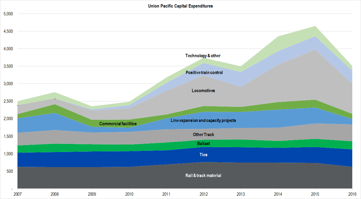
Here is the first of those graphs.

Figure 1. Source: Company Statements, Framework Investing Analysis
Before 2007, the data are not as finely broken out as this. One category, “Track,” consists of the four bottom-most sections (through “Other Track”) in the diagram above. Another “Capacity and Facilities” consists of the two sections just above the Track sections in the diagram above. Last is “Locomotives and Cars,” which is shown by the top three sections in the diagram above.
A few things stuck out to me in particular looking at this graph. First, the light gray region, “Locomotives,” looks to have increased significantly starting in around 2011. Second, the company severely contracted its “Line expansion and capacity projects” layer — shown in light blue — in 2016. Last, I couldn’t help noticing how consistent the spending was on the “Track” categories.
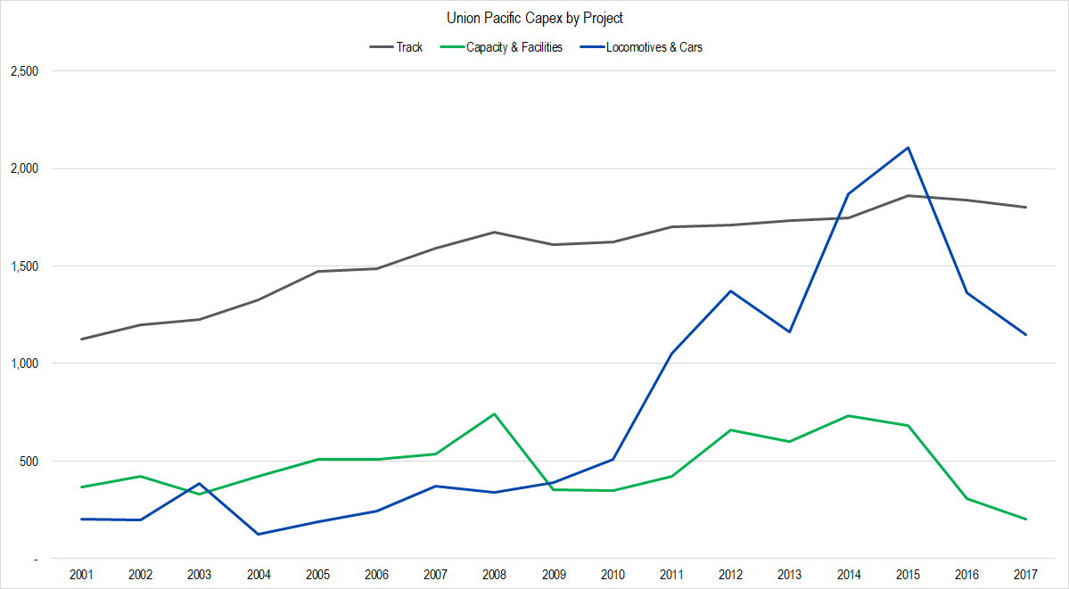
The higher-level grouping data was available for several years previous, so I pulled those into another graph along with my best ideas for how 2017 will turn out based on results in the first three quarters. Here’s that graph:

Figure 2. Source: Company Statements, Framework Investing Analysis. The company has guided to a Capex spend of $3.1 billion this year – our 2017 forecasts equal that amount.
In this graph, we can see that the drop-off in locomotive spending (included in the blue “Locomotives & Cars” line) is continuing in 2017, and that the drop-off in Capacity & Facilities is even more extreme this year than last. This tells me that my assumption that the company is battening down the hatches due to soft operating conditions is indeed occurring.
Digging into locomotive spending a bit, I realized that the relative proportion of leased locos to owned ones adds a bit of complexity. I’ll discuss that dynamic in my next post.
Looking through these data also allowed me to refine my estimates for what spending should be included in “Maintenance Capex” and what should be considered as growth investments. I’ll discuss this in a later post as well, since this has an impact on our model’s profitability and cash flow assumptions.
