Of the three main valuation drivers I discuss in The Framework Investing–revenues, profits, and investment level and efficacy–investment efficacy is the hardest to pin down.
Investment efficacy is the the degree to which a company can find investment opportunities that will allow future profits to grow at a robust rate, and can successfully exploits those opportunities by investing some or all of the owners’ current profits. As readers will know, investment efficacy mainly affects the medium-term growth rate of a company.
A company that invests well should see a growth in profits that is fast (perhaps very fast, if the investment opportunity is truly great and the company’s size is relatively small). A company that invests poorly will see slow profit growth (added to the sting of these substandard results is the knowledge that the managers squandered owners’ profits to achieve them).
When an investor tries to gauge a company’s investment efficacy in order to project a medium-term growth rate, there are two main tools available to him or her:
- An analysis of the company’s prior investing efficacy.
- An analysis of the company’s present strategic position and of the availability of attractive investment opportunities for it.
Of these two, the first is the easiest to do, and is the subject of this article.
Just as in the mutual fund world, past performance gives no guarantee of future results, so just looking at historical investment efficacy and trying to make projections about future growth is unwise–especially for companies transitioning from a period of very high growth to one of more modest expansion. However, understanding how well a company has invested its owners’ profits in the past allows an investor to get a sense of how competent the management has been in assessing and seizing opportunities.
Since we are talking about growth, it makes sense to see what academic researchers have published on the topic to help us chose an appropriate yardstick by which to measure it. The seminal work on this topic was published in 2001 by Mssrs. Chan, Karceski, and Lakonishok, entitled
The Level and Persistence of Growth Rates (available on the
Archives tab of the
Framework Investing site)
Among the group’s main findings includes this:
Our median estimate of the growth rate of operating performance corresponds closely to the growth rate of gross domestic product over the sample period.
This finding suggests that we should view GDP growth as a yardstick to judge the investing efficacy of a company. If a company has been able to make its owners’ profits expand at a rate better than GDP, the company has shown good investment efficacy; if not, its investment efficacy has been poor.
Over the past several years, I have struggled to settle on a way to display investment efficacy graphically. In Chapter 5 of The Framework Investing, I provide the example of Oracle (ORCL) using a graph like this:
 |
| Figure 1. |
This representation is okay, but it shows the difference between the company’s growth and GDP as a single quantity, so it is difficult to know whether the company was performing especially well at a certain time or if the economy at large was simply performing badly.
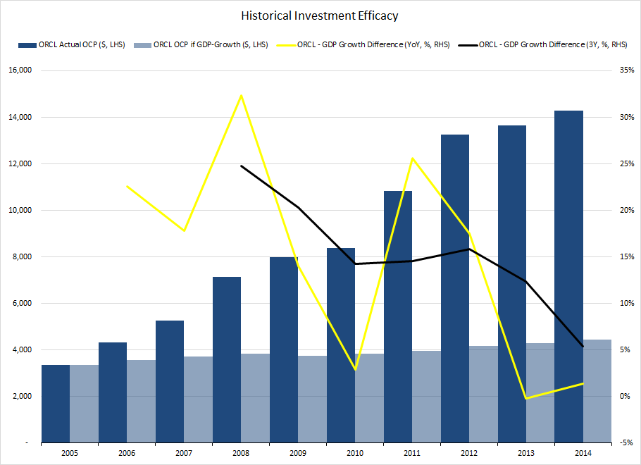
To preserve this information in a graph, I have started using the following diagram in my own models:
 |
| Figure 2. |
This graph adds several pieces of information that the first graph omits. (You can also find this graph, as well as other graphs in my most recent analysis of Oracle on the
IOITools site under the
Resources tab.)
The dark blue columns represent the actual level of Owners’ Cash Profits (OCP); the light blue columns represent the level of OCP the firm would have produced if it were to have grown at only GDP. As such, we can get an idea of whether the relative out-performance was due to the company growing its profits quickly (yes, in the case of Oracle) or if the company’s OCP growth exceeded that of the economy only because it was more stable in a downturn (such as the example of Wal Mart WMT given in Chapter 5 of the book).
The yellow line in figure 2 is the same as the black line in figure 1. It shows the difference between the percentage growth of the company’s OCP and that of the economy at large. The black line in figure 2 shows this same OCP-GDP differential over a rolling three-year period, so is less volatile than the yellow line and allows one to see the trend more clearly.
Because Oracle is a new firm, whose growth in revenues and profits has been very high (partially as a result of acquisitions), the difference between the dark blue columns (actual OCP) and the light blue ones (theoretical OCP assuming GDP growth) is very large. By the time we are looking at the most recent year, it is difficult to tell if the company is growing quicker than the economy at large without reference to the yellow and black lines.
If we run this graph using a different company–General Electric (GE)–which has been in the process of a multi-year divestment program, the graph looks very different.
 |
| Figure 3. |
Here, because of the divestments, GE’s profits have actually been falling since a peak in 2008. (In
my videos outlining my valuation of GE, I point out that while profits have been falling, this has actually boosted Free Cash Flow to Owners (FCFO), meaning that, in a sense, the company has been “selling” profits to “buy” free cash flow.)
If one did not know anything about GE, simply seeing the chart above should prompt questions like “Why have profits been lagging the economy at large since 2008?” or “Will profit growth stop falling and reverse itself at some point?”
The model and the graphs associated with it, like those above, point an investor toward the right questions to ask. Learning about the company’s valuation drivers gives an investor the basis to answer them. This process is one of the pillars of intelligent option investing.