
Drawing from the data we used for our DataBite on Coca-Cola, we created a heat map of relative valuation for the thirty-three large cap consumer staples companies.
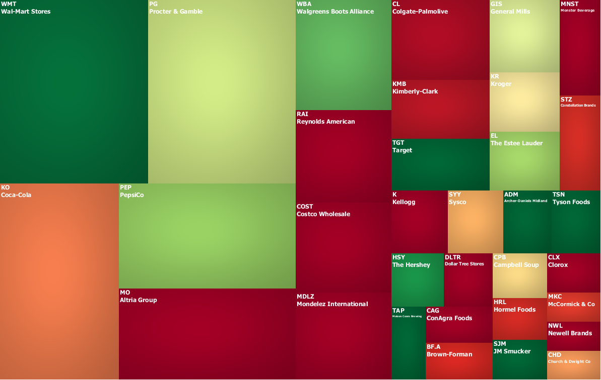
Figure 1. Source: YCharts (data), IOI Analysis.
In this graphic, market capitalization is represented by the size of the boxes. The color is meant to represent divergence of present price-to-OCP from its historical mean (OCP or Owners’ Cash Profits is IOI’s preferred measure of profitability). Red shading indicates that the present price-to-OCP is higher than the 10-year mean; green indicates that it is lower.
Those of you who have taken IOI training courses know that we don’t place a lot of weight on quantitative screens like this, but sometimes, they can be helpful to identify companies for deeper investigation.
The data we used to create this map is here. For the historical average, we used data starting in the third calendar quarter of 2000, extending through the first calendar quarter of this year.