Measuring the success of a company’s investment program is both vitally important and very difficult for an owner. It’s vitally important because as alumni of IOI Training Courses know, it is a company’s present investment programs that act as the main driver of the medium-term profit growth at the company. It is difficult because, as owners without inside information about specific projects, there is a lot of guestimation that goes into any analysis.
As long-time readers of our work will know, our preferred solution to measuring investment efficacy is to assess historical growth of the company’s profits versus our benchmark (the growth rate of nominal GDP). An article posted here about two years ago explains the process we use in detail.
The graph we have used in IOI ChartBooks and other research to express efficacy looks like this:
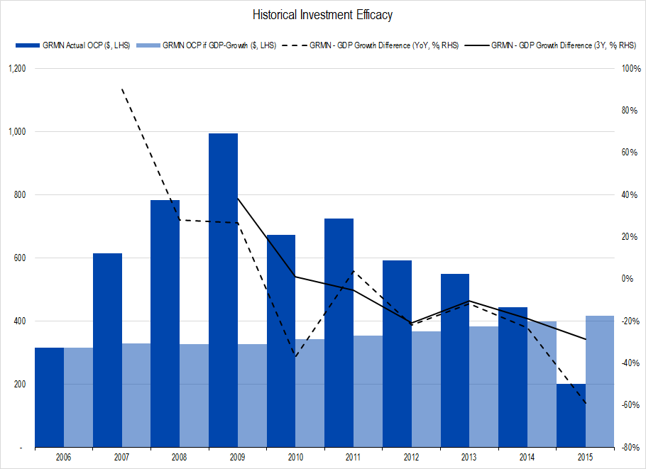
Figure 1. Garmin ($GRMN) Investment Efficacy from the ChartBook on the company we will soon publish to IOI members. Source: Company Statements, IOI Analysis
This representation compares the actual growth in profits at Garmin (dark columns) to what profit growth would have been if they moved lock-step with nominal GDP over the period (light columns).
Obviously, the graph is very sensitive to the starting point from which one measures – a weakness of the representation about which we’ve always felt uncomfortable. Garmin ($GRMN) grew much more quickly than GDP in the 2007-2009 period, thanks to the rapid acceptance of GPS navigation systems in automobiles. However, if we measured the company’s profit growth from its 2009 peak against GDP, it would have underperformed terribly. GDP growth may have been tepid post financial crisis, but Garmin’s profits (using IOI’s preferred measure of Owners’ Cash Profits or OCP) crashed by about 80%!
To overcome this sensitivity to starting points, we started thinking about better ways to represent this. The method on which we finally settled has its weaknesses too, but does more accurately represent historical investment efficacy, in our opinion.
First, we start with actual profit in the first year of our historical series and increase that profit at the rate of nominal GDP growth for the remaining time. Then, we compare that series to the actual profits the company generated over that time and count any positive number as an “excess” and any negative one as a “deficit.”
Then, we do the same thing starting in year two and keep repeating for the first five years of the 10-year historical series. Once done, we have a “waterfall” of excesses and deficits that looks like this (we use Garmin in this example):
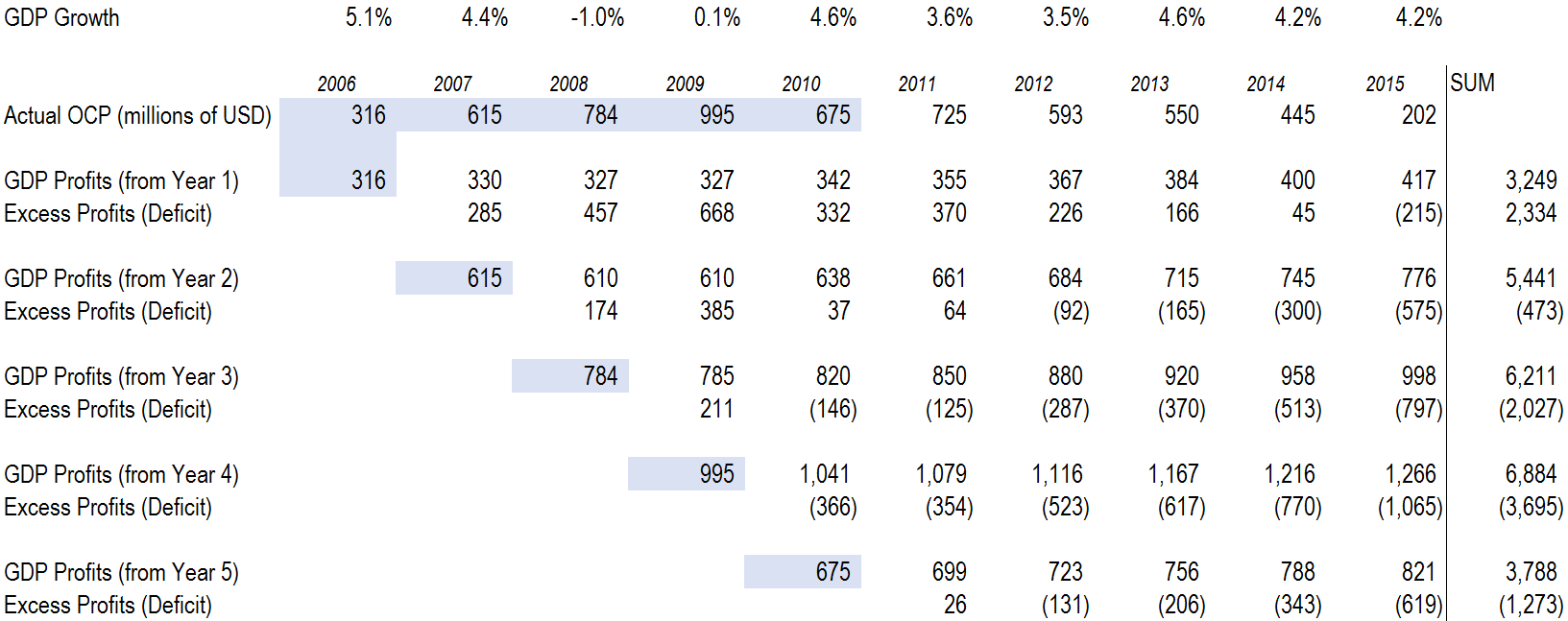
Figure 2. Source: Company Statements, IOI Analysis
You can see that in Garmin’s case, when measured from Year 1 (2006), the company generated excess profits for all years but the last, for a cumulative excess of $2.3 billion.
Moving down to Year 2, however, the company generated excess profits for only four of the remaining eight years, generating a deficit of $473 million.
After repeating the process for years 1-5, we made a graph of each cumulative excess or deficit and came up with the following:
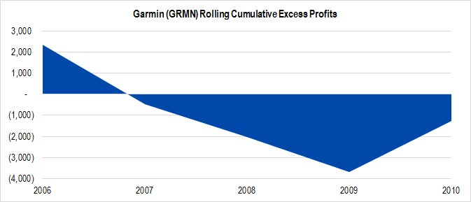
Figure 3. Source: Company Statements, IOI Analysis
Note that we are only running this analysis for the first five years of our 10-year historical series. This is because it often takes several years for the effects (positive or negative) of corporate investments on the profits of the firm to show up. This analysis is essentially looking at the investments of from 5-10 years ago and judging how those investments influenced profit growth in the subsequent period.
This graph accurately represents the poor efficacy of Garmin’s 2006-2010 investments on the profits earned by the firm. It also seems to show that efficacy is rebounding somewhat – something that we found true in the analysis we recently published to IOI members.
Over the 2006-2010 period, Garmin spent a total of $427 million on what we term Net Expansionary Cash Flow (i.e., “investments”) and over the entire 10-year period, its rolling cumulative deficit summed up to be ($5.1 billion). In contrast, if the firm’s profits would have grown from each starting year at GDP, owners would have had a rolling cumulative profit of $25.6 billion. Another way of thinking of this is that Garmin generated cumulative rolling profits of around $20.5 billion – “growing” about 20% slower than the economy at large.
We use quotation marks around ‘growing’ because these “rolling cumulative” numbers do not express a real amount of money that could be made (because we can’t go back historically and add together profits under different starting conditions and scenarios). However, a comparison of the two numbers gives a good indication of the degree to which the company’s past investments were or were not efficacious.
This analysis and graph seemed valid in Garmin’s case, but we thought we would run the numbers against several other companies for which we have published valuations and see if those graphs resonated in those cases as well. Here are the graphs we created along with commentary on each one.
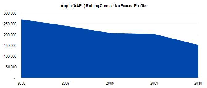
Figure 4. Source: Company Statements, IOI Analysis
Apple’s ($AAPL) investments in the iPhone franchise in the mid-2000s were a grand slam home run. The firm spent at total of $1.3 billion from 2006-2010, and the cumulative rolling profits generated imply growth that is 360% faster than GDP.
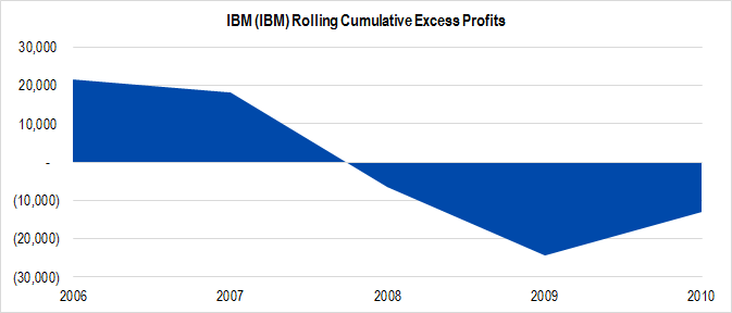
Figure 5. Source: Company Statements, IOI Analysis
IBM ($IBM) has been disinvesting and realigning its business since the financial crisis, and the results have been disruptive, as seen clearly above. The firm spent at total of $17.8 billion from 2006-2010, and the cumulative rolling deficit generated was ($4.0 billion), compared to $492.4 billion under the rolling cumulative GDP growth scenario. This works out to a very small “growth” underperformance of just under 1% less than GDP.
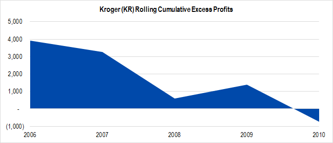
Figure 6. Source: Company Statements, IOI Analysis
Kroger’s ($KR) investments in organics in the mid-2000s have been very successful in boosting profit growth over the past 10 years. The firm spent at total of $2.5 billion from 2006-2010, and the cumulative rolling profits generated was $8.4 billion – an improvement on GDP growth by around 16%.
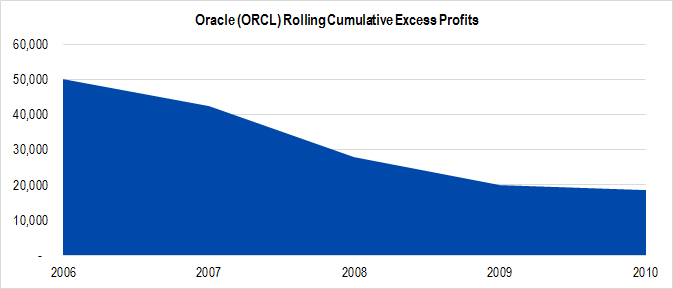
Figure 7. Source: Company Statements, IOI Analysis
Oracle’s ($ORCL) moves into hardware and applications in the mid-2000s have done a terrific job of generating excess profits for its owners. The firm spent at total of $29.5 billion from 2006-2010, and the cumulative rolling profits generated imply growth 65% times faster than GDP.
We think these graphs are a fairly accurate depiction of what we consider their true past investment efficacy, so will continue using these graphs in our analyses and will incorporate them into the suite of investment analysis applications we are in the midst of developing!