One of the great things about using OCP as a profit metric is that, unlike non-cash measures of profit like EBIT or Net Income, aggregating OCP – adding up total OCP across sectors or indices – makes economic sense.
Most of the research we have published so far deals with applying our framework to individual companies, but we have been anxious to apply our valuation framework to industries, sectors, and the market as a whole.
I have been working with a business school professor friend of mine to use an academic database to aggregate revenue and OCP for the US market with a view of giving Framework Investing members a proprietary edge – understanding the value of a basket of stocks as a way to make more intelligent “quasi-passive” investments via ETFs.
Our work is still in its early stages – this video is a first look at aggregate OCP – but has turned up several interesting insights already.
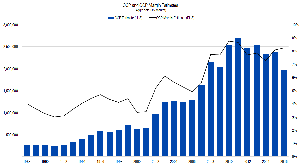
Figure 1. Source: Compustat, Framework Investing Analysis
This is a chart of our estimate of Owners’ Cash Profits – represented by blue columns and read off the left-hand scale – and OCP margin – represented by the black line and read off the right-hand scale – since the end of the Reagan era.
There is a notable drop in absolute OCP in the last year of the series – 2016. We queried the number of companies in our data download and noticed that there is a big decrease in that statistic in 2016 as well.
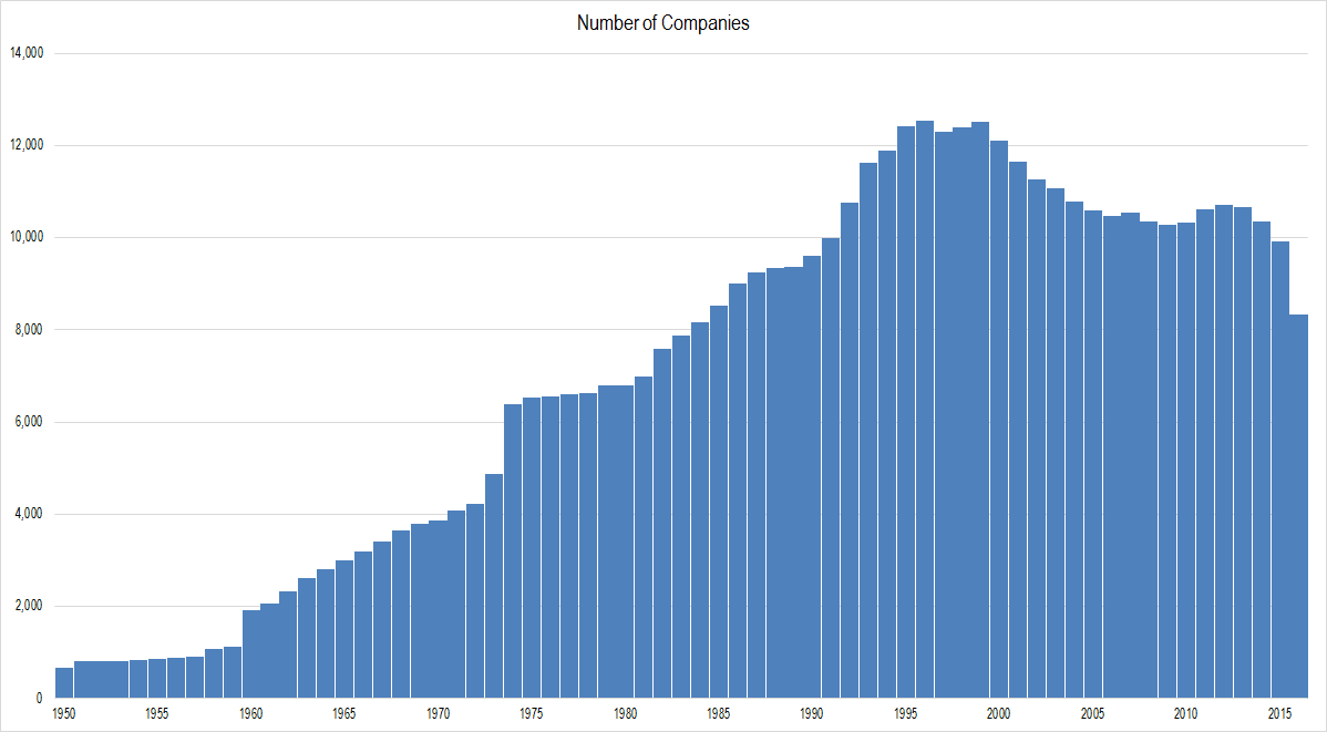
Figure 2. Source: Compustat, Framework Investing Analysis
Because of this drop off in reporting companies, we cannot trust OCP growth statistics, but we should be able to trust OCP margin numbers because that is OCP normalized by revenues.
One quick look at the OCP margin line (figure 1) tells a very interesting story. During the 13-year period from 1988-2001, OCP margins ranged from 3% to 5%. 2002-2007 saw a dramatic increase, and now aggregate profitability seems stable in the 7%-9% range. Or to put it another way, aggregate profitability at US firms have doubled in the 15 years since 9/11.
This is interesting both in itself and with respect to other common measures of aggregate profitability such as the Cyclically-Adjusted P/E Ratio, first made popular by Nobel prize winner, Robert Shiller of Yale University.
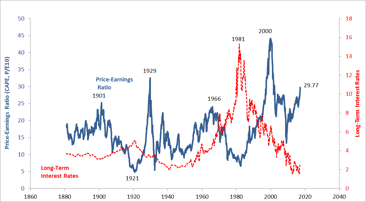
Figure 3. Source: Robert Shiller (data and updated chart available on his website)
The long-run average value of the CAPE is roughly 16. Recently, market pundits have been calling for a big fall in equity prices because the present value is so much higher than the long-run average.
However, our initial study of OCP margins clearly show that the profitability of firms – after taxes and interest payments – is increasing. This suggests that the CAPE’s long-run average of 16 may no longer be applicable; if base profitability is durably higher – as is suggested by the average OCP margin values since around 2007 – there should not be an expectation of the CAPE mean-reverting to its prior historical average.
Assuming 10 years’ worth of stability at the 7%-9% margin level, I then looked at what margins were in 2016 versus the 10-year period for each of the S&P sector classifications.
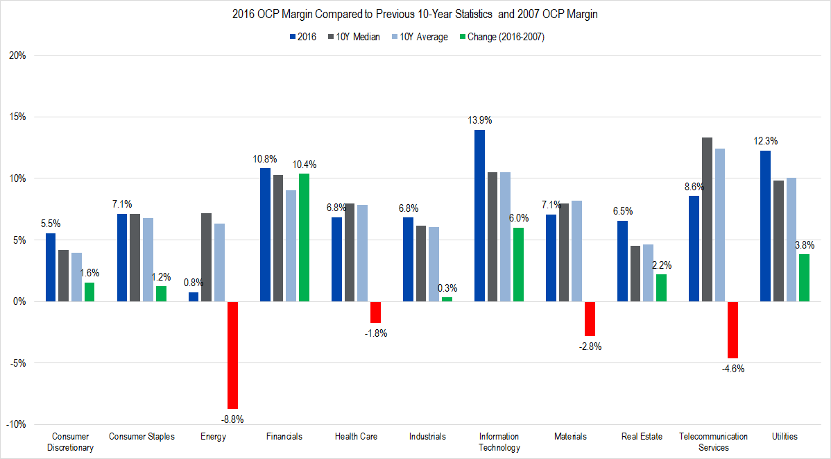
Figure 4. Source: Compustat, Framework Investing Analysis
The dark blue column in each sector grouping is the aggregate OCP margin for that sector during 2016 – the most recent data available. The gray column represents the 10-year median margin, including 2016; the light blue column is the average margin over the same period, and the fourth column shows the change from aggregate OCP margins in 2007 to those in 2016. If margins were lower in 2007, this column is green; if margins were lower in 2007, it is red.
The first thing I noticed is that in seven out of 11 sectors, 2016 margins were higher than 10-year median and average values. The four sectors whose 2016 margins were below median and average values were those which had higher margins in 2007: Energy, Materials, Health Care, and Telecommunication Services.
Energy and Materials margins certainly should be lower now, given where energy prices are and the overcapacity for building supply in the Chinese market. Health Care margins may be down slightly due to pricing pressures from Obama Care. A recent Wall Street Journal article claims that Telecommunication Services have been in a deflationary trend, which might explain the margin contraction here.
This view of the market is more sobering. It suggests that the majority of businesses are operating at or near peak Owners’ Cash Profits levels, meaning that profit growth in the future is likely to be tied to increases in revenues, not to increasing efficiency. This observation ties back to our feeling lately that it is relatively difficult to find compelling bullish investment ideas in the US market at present.
The concepts underlying all this work are all laid out in the Framework 102 course on Valuation. This course and our others are a good place to start to develop a sound framework for assessing value – whether on the company level or on the sector level.
These are just our initial forays into analyzing these data, but they are encouraging. We will update the Framework community as we dig in.