

Transcript
Hi everyone and welcome to Sunday Morning Coffee with Erik.
Today, I’m looking at an article that I published last week in Forbes – What Does A Monopolist Look Like? It Looks Like Union Pacific.
I will not go through all my argumentation – you can read this on my site on Forbes – but essentially what it boils down to is that I’m looking at whether or not it seems like Union Pacific (UNP) is generating excess profits in comparison to some of its competitors in trucking.
The trucking industry is brought up as a competitor to rails so I’m just comparing the profitability between those two. One of the qualities of a monopoly is its ability to generate excess profit and my argument boils down to that. UNP is generating excess profits, so must qualify in some sense as a monopolist.
This line of reasoning got me thinking: what profitability is comparable on a sector or industry level to Union Pacific’s 2016 OCP (“Owners’ Cash Profits”) margins.
To look at this, I went over YCharts and pulled back trailing twelve-month (TTM) revenues and trailing twelve-month Owners’ Cash Profits for all the S&P 500 firms and then associated the sector and industry with those.
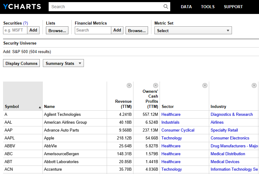
Then I just dumped those data into Excel and create a pivot table, which has aggregate revenues and aggregate Owners’ Cash Profits for each of these industries and sectors.
Well, it was enlightening when I did this and charted all these data out. This is a chart of the S&P 500 sectors – the largest division of companies within the S&P 500.
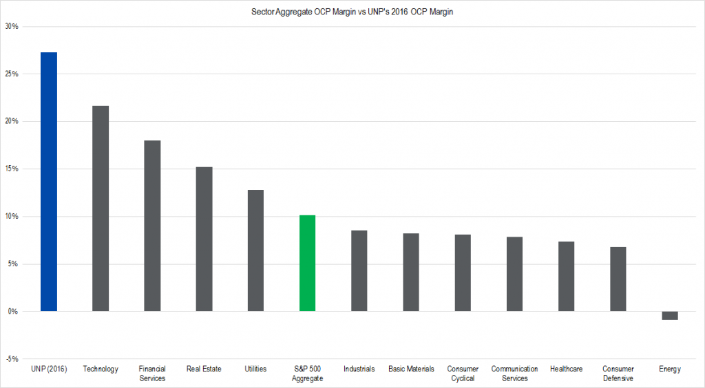
Figure 1. Source: YCharts, IOI Analysis
You can see the each of the sectors is listed in decreasing order of profitability looked at from an Owners’ Cash Profit margin basis.
Technology is the highest all the way down to Energy – which is actually negative right now – and you can see that the S&P 500 aggregate (i.e., the average) is shown there in green.
That blue column way off to the left is Union Pacific’s Owners’ Cash Profit margin for 2016. So it’s more profitable then all of Technology in aggregate! This is really surprising! If you think about a business that really has a lot of intellectual property and one that might be able to generate very high profitability, you would think about Technology.
Sectors are the broadest level of categorization and so I decided to run the same experiment looking at industries, which represent the next level down of categorizing companies.
There are a lot of industries and so I didn’t make it a chart with all them, but I just picked the top industries in terms of OCP margin. Here’s what I found:
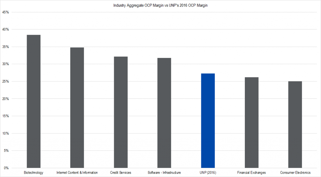
Figure 2. Source: YCharts, IOI Analysis
In the interest of full disclosure, I actually did delete out two REIT industry groups that would’ve been in this in this graph as well. This is because I’ve been looking at REITs lately and I know that REIT OCP margins are not really comparable.
So again here UNP is in blue. It’s not the highest but look at the company that Union Pacific is in!
Biotechnology (e.g., Gilead – GILD) Internet Content and Information (e.g., Alphabet – GOOGL), Credit Services (e.g., Visa – V), Infrastructure Software – and this industry represents companies like Microsoft (MSFT), which has a virtual monopoly on in a business productivity software and operating systems. Here’s UNP at 27.3% margins – even higher than Financial Exchanges – which are certainly examples of monopoly businesses – and Consumer Electronics, which mostly represents the results of Apple (AAPL).
This was a real eye-opener to me and it just made me realize again just how profitable UNP is; and this in itself seems fishy.
The building of the railroads was publicly funded and my argument is that in a sense, these companies are still subsidized by the US government because they’re not being regulated very carefully by the regulatory body – the Surface Transportation Board.
That’s my argument in a nutshell, and what I thought was an interesting comparison between industries and sectors and the profitability of UNP.
Thanks for joining me! Talk to you soon!